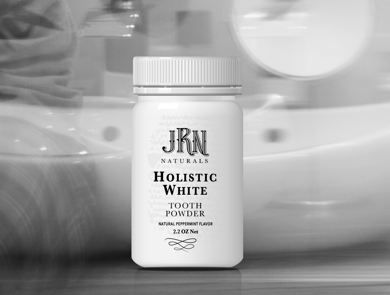
The Challenge: JRN Naturals, developed by Dr. James Nemeth, needed a brand and packaging system that felt premium, trustworthy, and appropriate for a clinical environment while remaining warm and approachable for patients.
The Approach: I translated the client’s vision into a restrained, apothecary-inspired packaging system. The focus was on typographic hierarchy, vintage cues, and material-conscious design to balance medical credibility with a high-end, human feel.
The Solution: A refined brand identity and packaging design featuring scripted initials, curved framing, and disciplined typography. The system was designed to display seamlessly within a periodontal practice, reinforcing quality and care at the point of interaction.
The Impact: The packaging established a distinctive, premium presence within the practice, supporting patient trust and presenting the product as a considered extension of the brand experience.
My Role: Art direction, brand identity, package design, system development, and final production files.